Overview
The
challenge
Furnishing and decorating a first home is exciting — but it can also be overwhelming. Most interior design resources assume prior knowledge of styles, generous budgets, and spacious rooms. Young adults moving into their first flat face a very different reality.
The challenge was to design a website that meets users where they actually are: inexperienced, budget-conscious, and time-poor. Hausglück was created to fill that gap — a welcoming hub where young people can discover their personal style, find practical inspiration, and connect with a community of people in the same situation.
Value Proposition
What makes
Hausglück
different
Personalised style discovery — users take a decoration style quiz to find their aesthetic before diving into content, removing the paralysis of choice.
Community and feedback — the platform encourages interaction, so users can share photos, tips, and support each other through the decorating process.
User-first experience — every page is designed around users' real constraints: small spaces, limited budgets, and zero prior decorating knowledge.
Define Phase
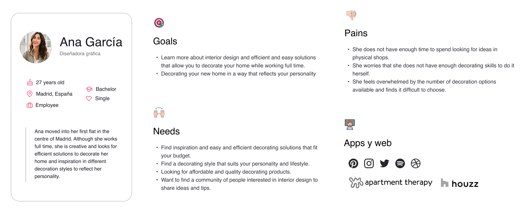
User
Persona
To ground design decisions in real user needs, a primary persona was developed representing the core target audience — a young professional moving into her first flat, looking for affordable and creative decorating solutions that reflect her personality.
Ideation Phase
Information
Architecture
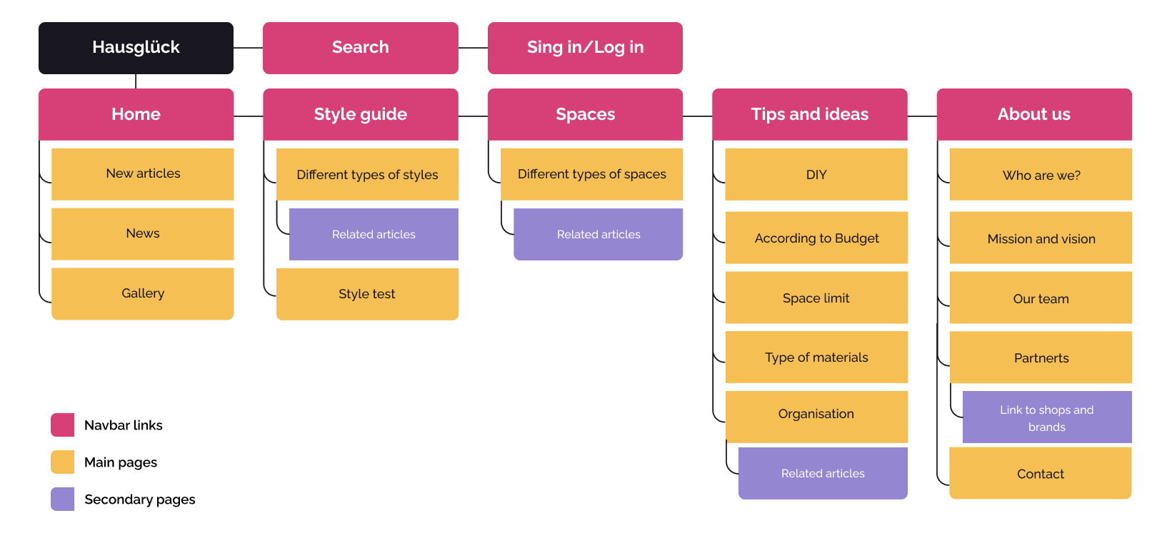
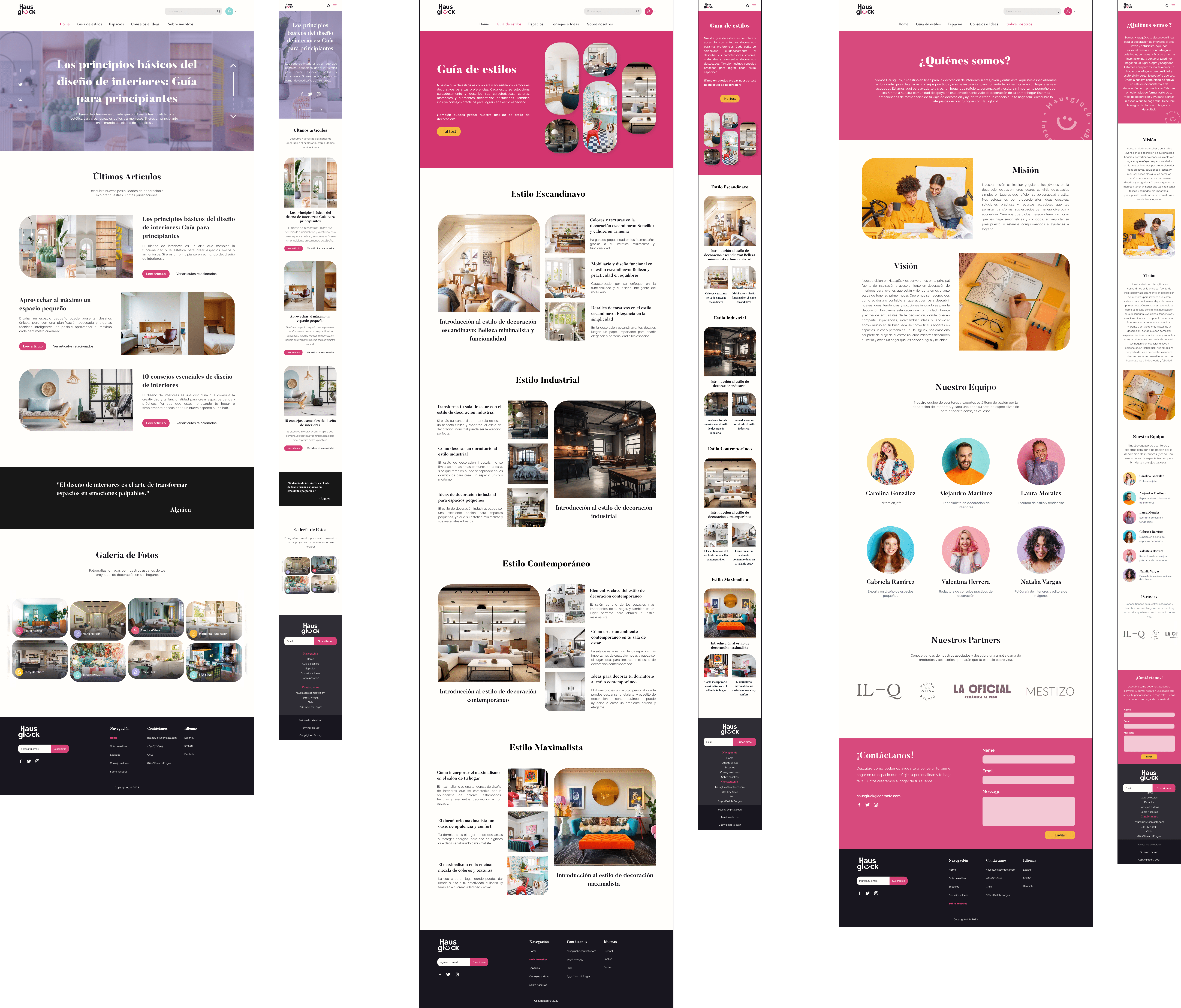
The site structure was designed to let users find content intuitively, following patterns from other editorial and lifestyle websites. The homepage acts as the central entry point; secondary pages branch from the main navigation in a clear and logical hierarchy.
Design Phase
Graphic
Branding
The identity is built around warmth, joy, and accessibility. The name Hausglück — a portmanteau of the German words for house (Haus) and happiness (glück) — sets the emotional tone. The logo is a wordmark in the display sans-serif Rockhill Sans, where the letter "ü" is extended to simulate a smile.
Colours were selected for their association with positive emotions. Gluck Pink leads as the primary brand colour, with Yellow Gluck as a warm, energetic secondary.
Two contrasting typefaces help users scan at a glance. Butler's serif character brings editorial warmth to headings; Raleway keeps body text clean and modern.
The logo is a custom wordmark that plays on the "ü" to simulate a friendly smile, reinforcing the welcoming nature of the brand.
User Interface
Mid-Fidelity
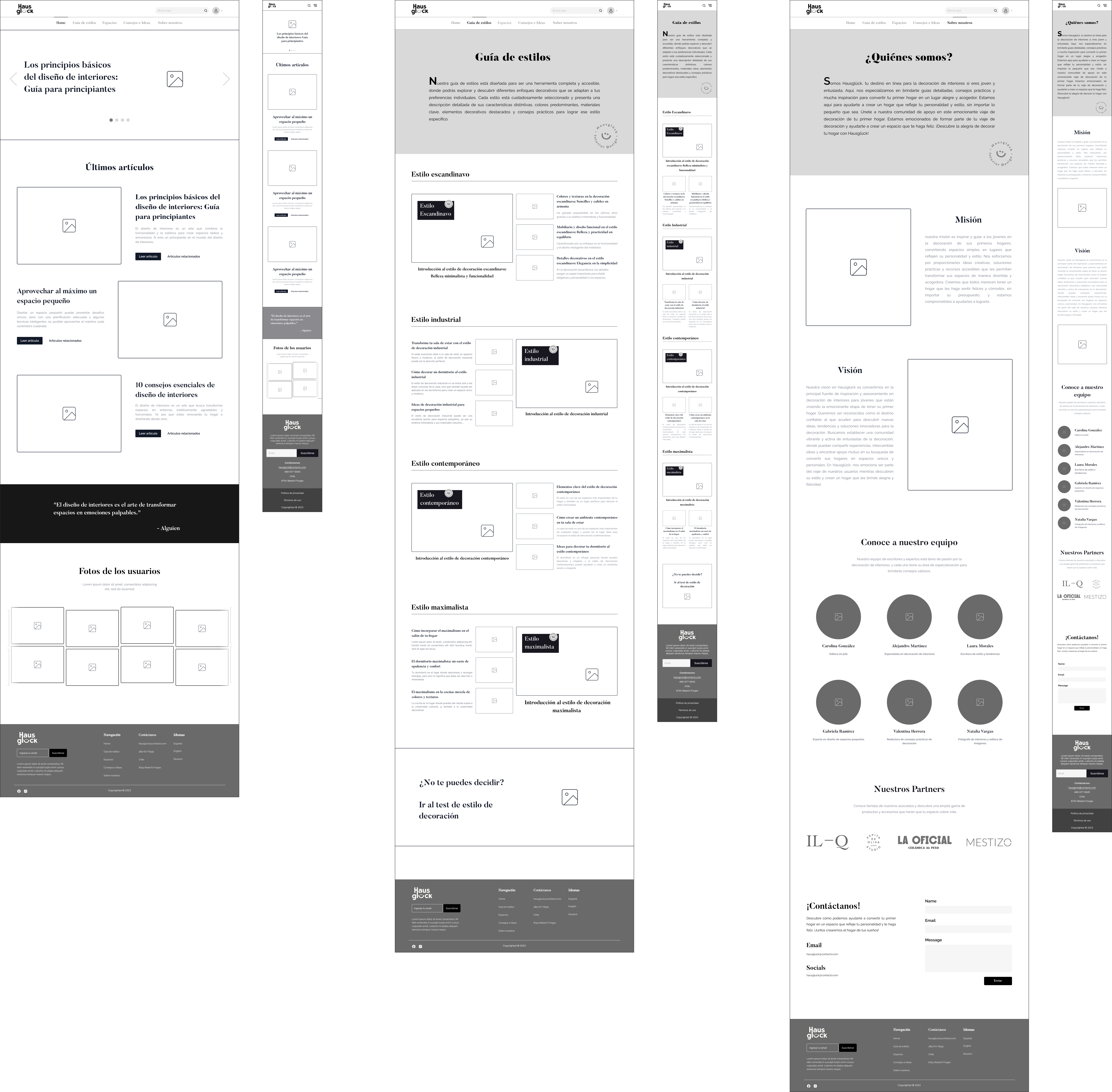
Wireframes
Mid-fidelity wireframes were built to validate layout decisions and information hierarchy before applying the visual system. Both desktop and mobile breakpoints were explored at this stage.
User Interface
High-Fidelity
Prototype
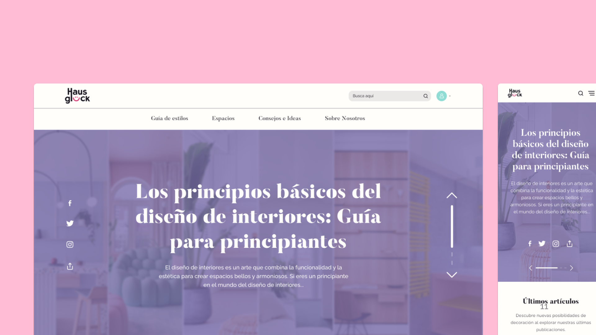
The high-fidelity prototype applies the full visual system — Gluck Pink as the dominant brand colour, Butler headings, editorial photo layouts, and a warm, youthful tone — across all key pages.
Reflection
What this
project taught me
Hausglück was a design project that showed how emotional branding and practical user experience (UX) can work well together. I learned how to set the right emotional tone for users when they are trying out a product by developing a cohesive identity. This also shaped layout choices, which in turn influenced how content was structured and categorised.
In the end, the process showed how a well-planned design system can make a system into an easy-to-use and helpful community hub.